


/ Blog
Microcopy for eCommerce: How Small Words Can Drive Big Sales

Asiya Nayeem
Content Marketer
- DATE PUBLISHED (26/4/2021)
- READ TIME (5MIN)


<iframe allowfullscreen="false" data-src="https://spkt.io/a/2505068" frameborder="0" id="speechkit-io-iframe" scrolling="no" style="display: none"></iframe>
<script src="https://cdn.jsdelivr.net/npm/@speechkit/speechkit-audio-player@latest/dist/speechkit-iframe-helper.js" type="text/javascript"></script>
Sometimes, it feels like a website is driving you in circles. We’ve all been there. You don’t know where you should add the coupon code. You can’t find shipping timings. Or worse, you filled out your details wrong but you need to use guesswork to figure out what that was.
Frustrating, isn’t it?
It stings more when you see visitors struggling with this problem on your own store. These visitors might take a few seconds to try to figure out the issue on their own but pretty soon, they end up dropping off from your eCommerce site.
To solve this, it’s best to take advice from a couples therapist— You need better and clearer communication (with your store visitors).
By pointing out clear directions for what they can do next or how they can solve an error, you can help your store visitors get to checkout faster. This guidance that you provide to your potential shoppers is microcopy.
Let’s start simple. What is Microcopy?
Microcopy is the short text that helps your website visitors to take action or guide them in the right direction. Due to the space constraints, the microcopy on your site needs to be as brief as possible while providing clarity, addressing concerns, and providing context.
Think of microcopy as directions for your store visitor as they navigate through your site, giving them helpful tips and nudges to effortlessly get them from your homepage or product page to your cart and eventually, your thank you page.
Here’s how using microcopy helps.
Microcopy helps your shoppers in multiple ways:
1. Creates context for next actions
Microcopy gives your store visitors more context about the next action they can take like adding an item to the cart or being informed that the next step in the checkout process is the payment.
2. Creates clarity over the right kind of information to enter
With tooltips and click triggers, microcopy helps shoppers understand the kind of information required.
3. Builds credibility by clarifying concerns
Reassure shoppers about concerns they have, like about payments, returns, and security, clarifying concerns and creating credibility for your brand.
4. Builds trust through testimonials and value proposition
Convince store visitors to buy from you and increase purchases through well-placed value proposition statements and testimonials.
5. Delights shoppers to enhance their experience
Whether it’s post-purchase or an unlocked coupon, make your shoppers feel special, guaranteeing better conversions and customer retention.
Well-crafted and optimized microcopy enriches your user experience, helping you build a relationship with your store visitors, increase credibility and trust for your brand, increase conversions, and boost your customer retention.
A guide to finding (and using) microcopy.
Microcopy is everywhere! If it’s doing a good job at guiding you to take an action or creating clarity over what to expect, you don’t even notice these invisible pieces of text. Typically, you’ll see microcopy in these 10 touchpoints across your eCommerce site.
1. Buttons
Microcopy on buttons guide your shoppers to take instant action— learning more about a product, viewing a collection, adding an item to the cart, or even completing a purchase. This copy is crucial, driving pivotal action that nudges visitors through the purchasing funnel and ultimately, improving your conversions.
Pro-tip: When it comes to your button copy, it’s best not to get creative. Stick with button text that shoppers are already familiar with. You may want to make it more conversational (like replacing “Add to Cart” with “Get It Now”) but it’ll just end up confusing your shoppers.
2. Click Triggers
Click triggers are any type of copy that convinces your shoppers to buy, building anticipation, creating curiosity, and improving clickthrough rates. These are placed across the site and used in different ways:
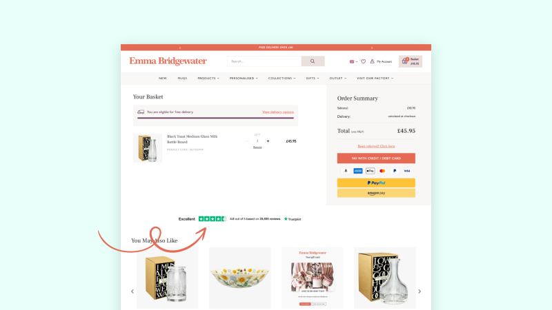
(1) Testimonials: Emma Bridgewater adds ratings to the cart page to show how well-loved the brand is, boosting credibility.
(2) Value proposition: Display a section featuring benefits of why the customer should buy from you or buy a specific product to build credibility and drive conversions.
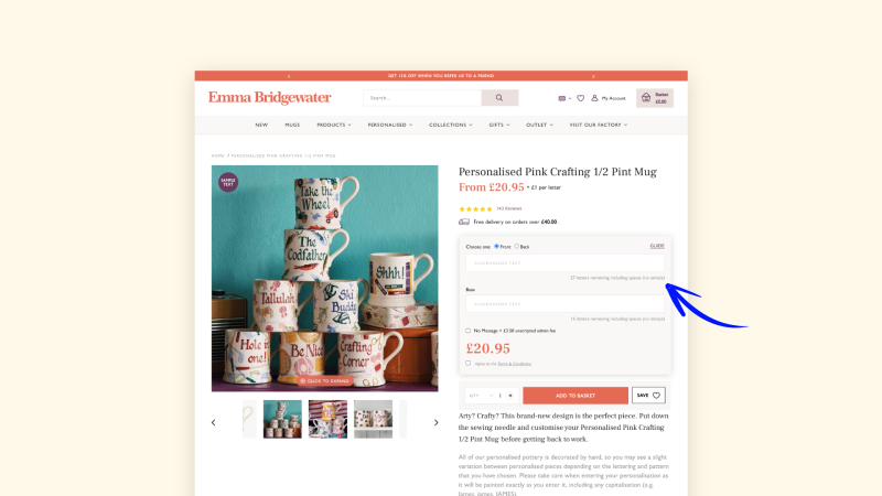
(3) Clarify information required: Clarify what you’re expecting from shoppers. Emma Bridgewater informs shoppers how many letters they can enter when personalizing their products.
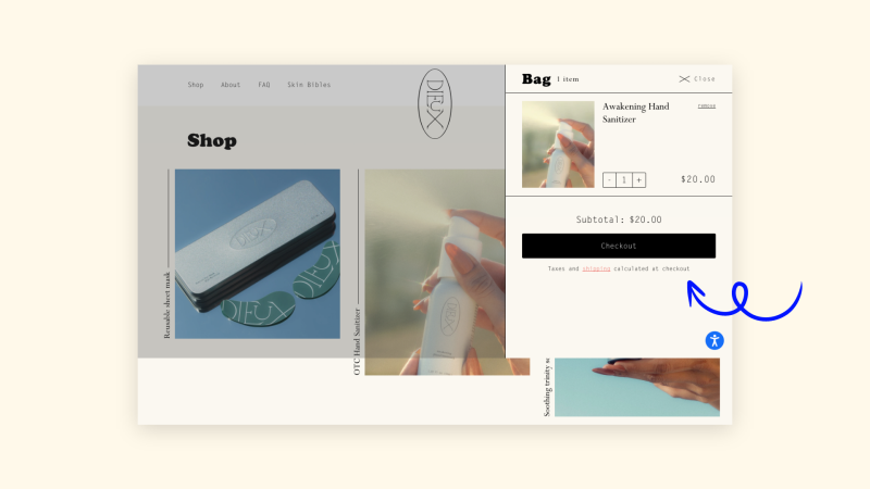
(4) Expectation setting: Clarifying statements like “Taxes and shipping calculated at checkout” sets expectations for shoppers, as Dieux does.
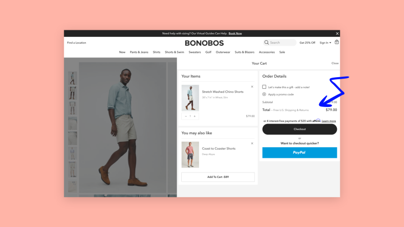
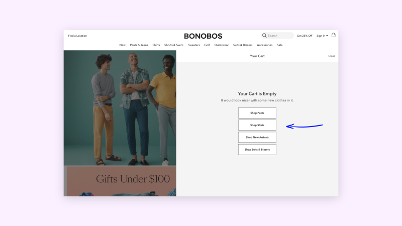
(5) Guarantees: Give customers all the information they need before proceeding to the next step. Bonobos displays a “Free U.S. Shipping & Returns” message within the cart drawer.
3. Search
The search experience on an eCommerce site is open-ended. From the wrong keywords to empty search results, there are a lot of deadends that your shoppers could end up stumbling onto.
With your search bar, you can use conversational text to give your shoppers more context about the kinds of keywords they can use when searching. This way, customers would be less likely to use vague terms. For instance, if you run a coffee brand, you can add microcopy in your search bar to suggest that people search for specific coffee beans or equipment.
Good copy can also help you avoid drop-offs when customers land on an empty search results page. A light-hearted text suggesting that searchers look for something else or even recommending products can get them back on track.
4. Empty Cart
Driving your customers back to browsing your products once they land on an empty cart is easy with the right copy in place. A witty one-liner or an enticing offer, paired with a button or two to bring the store visitor back to the product catalog, is sure to do the trick.
Bombas, for instance, informs shoppers what offers they can redeem when shopping, informs them that their cart is empty, and then gives them a few buttons to help them diversify into their preferred category.
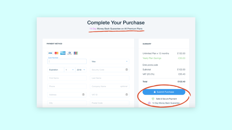
5. Security Information & Payment Forms
Customers are not fond of payment processes. With the right microcopy along your payment and security pages can help your shoppers in two ways:
Get clarity on what kind of information is expected
Help them trust your site
Death Wish Coffee ensures that shoppers don’t stumble during their payment process. They always add a disclaimer across sensitive checkout pages, reminding shoppers that transactions are secure. They also simplify the process of entering details by telling shoppers clarifying details about certain vague fields they need to complete.
6. Error Messages
Missed form fields, unselected options, and wrongly entered information— it’s all part of shopping online. But, oftentimes, in such cases, shoppers have to scan the entire page to figure out what went wrong. With a short explainer next to the field that they missed or entered incorrectly, shoppers can spot the issue instantly and would checkout faster.
While entering shipping details, Death Wish Coffee highlights errors in red under the fields that the shopper missed or filled out incorrectly.
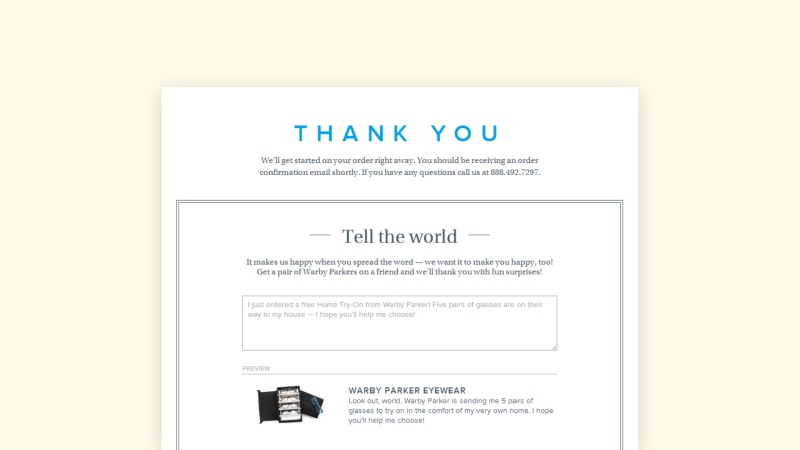
7. Thank You Page
Once a customer has taken an action, like subscribing to your emails or placing an order, you can use copy to make the experience delightful.
Warby Parker is an eyewear brand that uses comforting and warm language post-purchase. They communicate with their customers using a nurturing voice, showing gratitude and letting them know what they can expect next.
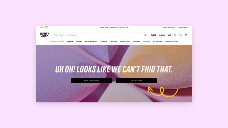
8. Error 404
Your visitors are sure to run into empty pages on your site, especially if you have a rotating product line. With your Error 404 message, your shoppers should be driven back to the right pages on your store, despite landing on a page that doesn’t exist anymore.
Just like the empty cart, a conversational sentence and a few quick links to your collections will bring your customers back into the shopper funnel.
Beauty Bay uses the dead-end to have a conversation with their visitors, suggesting different places they can head to on their site and directing shoppers back to the homepage.
Some best practices for writing microcopy.
Since microcopy is scattered across your website, the process to optimize existing copy and identify opportunities to add context may seem just as unstructured. These 5 best practices can help you set up better microcopy and elevate the user experience on your eCommerce store.
1. Optimize copy to test your shopping experience
Go through your complete shopping experience, from the homepage to your thank you page, to identify touchpoints where microcopy is placed. At each of these instances, you can use this question to understand whether the existing copy needs to be optimized:
Does this give the shopper enough information, clarity, or context to take the specified action?
Is the language consistent with the tone and style of the brand?
Is the copy short enough for the visitor to scan and quickly understand?
Is the copy eliciting the emotion you intended it to?
2. Create more context and think like your customers
When testing your site’s experience, you can also look for opportunities to add microcopy to enhance the customer journey.
When trying to identify touchpoints to add microcopy, put yourself in your shopper’s shoes:
What more information would they need to take action?
What concerns could customers have at different touchpoints on your site?
Can you use microcopy to make a tedious process more enjoyable?
3. Use your brand voice to build a consistent tone
Your brand voice needs to stay consistent across your entire eCommerce site. You can’t use an excited tone or a clickbait at one touchpoint and then use a reassuring tone at another.
By defining your brand voice and keeping it consistent, you can create a memorable impression for your shoppers and build a relationship with them.
4. Always keep it 8 words or shorter
No one wants to read long sentences, especially when shopping online. Your microcopy needs to be as short as possible. Some UX experts recommend keeping your on-site directions 8 words or shorter.
Want to explain more but can’t keep it under 8 words? Give your shoppers the option to head to a separate page for more information. For instance, you can inform shoppers that you have a “30-day return and exchange policy” and hyperlink it to your returns page or add a “Read more” text to explain further.
5. Humanize your language with a personal touch
Sure, your shoppers are interacting with a machine but it doesn’t have to feel that way! Use casual and conversational language to make the shopper experience more interactive. Here are some tips to liven up your microcopy:
Use “you” pronouns when referring to the shopper. It’s more direct and engaging.
Use inclusive pronouns when talking about the brand. For instance, “We are excited to have you here!” is more relatable than “Welcome to XYZ store!”
Don’t be afraid to use slang, if it fits your brand.
Celebrate the milestones with exclamation points and an excited tone.

How do you test out your microcopy?
Without testing, you can’t prove that the copy you’ve put in place works. Some parts of your store experience may seem obvious to you but through testing, you can confirm that shoppers are satisfied, or find areas where they may need more context.
There are two ways you can test the microcopy you’ve put in place— through your data and through the feedback you receive.
Data-driven Testing
Once you’ve set up your optimized and improved microcopy across your site, look into your data after 2 to 3 weeks to see if there is any improvement. While correlating your performance to your microcopy could feel vague, pinpoint metrics and improvements that are likely to be influenced by the copy that you recently changed or added.
For instance, if you clarified concerns on the payment page, do you see better conversions within your checkout flow? Or, if you enriched your homepage with well-placed CTAs, are you seeing more page views from your store visitors?
Qualitative Feedback
Besides looking at your data, you can also talk to your shoppers to get their opinion on your store experience.
You can collect feedback in a few ways:
Customer support: Ask your shoppers while they are chatting with you about their experience on-site.
Post-purchase feedback: Place feedback forms on your thank you page or ask for feedback within the order confirmation email, collecting responses from highly engaged shoppers.
Mid-browse surveys: You can also set up ratings-based surveys while shoppers are browsing your site.
When collecting such feedback, you can’t pointedly ask shoppers if the text on your site is better. Instead, these questions can provide more insight into how your microcopy is performing:
Are you able to easily navigate through the store?
How easy is it to understand what steps you need to take when shopping with us?
Is the experience of shopping in our store easy?
Did you have any difficulty browsing or placing an order in our store?
Say more with less, and delight your shoppers.
No one has time for a poor website experience, however great your products are. With these “invisible” pieces of text, you can subtly help your shoppers get to the products they want, get the right information, and make purchases effortlessly.
Microcopy is one of the most crucial but often overlooked aspects of your user experience. You must understand how it fits into your user experience, test, and optimize the copy across your site to provide a great on-site experience for your customers.
We hope this guide helped you understand the importance of microcopy. If you’re looking for an expert to help you optimize your user experience, our team at Coderapper is here to help!
Reach out to us at enquiry@coderapper.com to elevate your on-site experience and increase conversions.